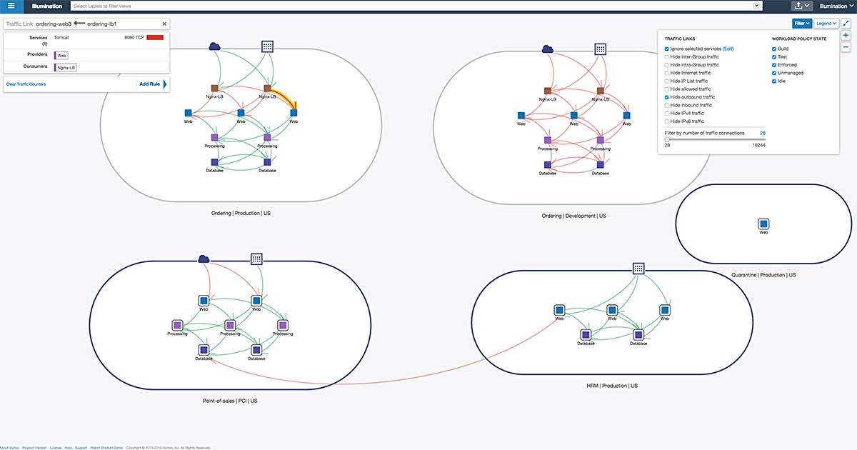
Over my fourteen-week internship at Illumio, I designed and developed Explorer, a data visualization platform to enhance network visibility and provide application dependency mapping.It's now a central feature of the Illumination product , and in production with many of their clients.
Motivation
With the number of devices connected to networks growing rapidly, and the increasing complexity of datacenter architectures, it is critical that companies understand who and what is running on their network. Illumio's Illumination product and other SDN visualization products solve this by generating a node-edge representation of datacenters that visualizes network flows as edges between logical and/or physical groups of workloads.

However, network representations like this (1) abstract away temporal information, and (2), summarize all network traffic between two nodes (potentially millions of flows over different ports, to different IPs, etc.) as a single line. This is neccessary to keep the graph legible, but can conceal misconfigurations, bad ACL policy, traffic anomalies, and threats. The goal, therefore, was to design an alternative micro-view of the network that accurately displays time-dynamics and traffic composition.
Implementation After researching and prototyping different data visualization techniques, we decided to create a multilayer interactive parallel-coordinates chart, with a synchronized force-directed graph.
The user inputs a query like "Tell me all the flows going into and out of my PCI environment", or "What traffic has crossed between my development and production environments in the last 60 days?" or "Where is my compute under-provisioned for high-availability or failover?".
The system would collect the flows that match the search query, and display it on the charts.
The parallel-coordinates chart displays flows for each unique source-destination-port tuple, allowing the user to see all the combinations of subflows without being visually overwhelming. They can click an axis to view the flows at a finer granularity by moving down a level of micro-segmentation - from location to environment to application to role to individual workloads.
The force-directed graph would show the logical topology and volume of traffic between the flows in that query, similar to the Illumination view.
After I designed and developed this system, I also researched how to scale the system to meet the demands of customers' large data centers. Using d3.js and React with Canvas, we could render tens of thousands of workloads and millions of flows concurrently in the browser, even while maintaining per-element interactivity!
Demo